
All projects
RTHK ON THE GO app icon

All-in-one Radio, TV and News Streaming App

Public media streaming mobile app

RTHK ON THE GO

Five RTHK apps, organised into one consistent experience.

Existing App AuditInformation ArchitectureUser FlowUI DesignAccessibility ConsiderationsDesign SystemDeveloper Handoff
Role
Senior Product Designer
Platforms
iOS · Android · CMS
Design output
A unified product direction for five standalone RTHK applications.

01

Project snapshot

The context, scope and value—at a glance.

Role
Senior Product Designer
Platforms
iOS · Android · CMS
Responsibilities
Existing App AuditInformation ArchitectureUser FlowUI DesignAccessibility ConsiderationsDesign SystemDeveloper Handoff
Design Output
A unified product structure and interface direction spanning five standalone RTHK applications.

02

Overview

One destination for five services.

RTHK ON THE GO brings radio, television, news, traffic and weather services from five separate apps into one unified mobile experience.

Users can enjoy live and catch-up programmes, discover archived content and manage personalised activity in one place.

03

The challenge

Reduce friction across fragmented services.

Five standalone apps created multiple starting points for related RTHK services.

The audit focused on overlapping content, inconsistent patterns and the number of interaction models across the app set.

04

Existing ecosystem & app audit

Five apps, multiple starting points.

The redesign needed to bring familiar RTHK services together without asking people to decide which standalone app to open first.

I reviewed the five apps as one product ecosystem, then identified the points where users had to relearn patterns or search for content.

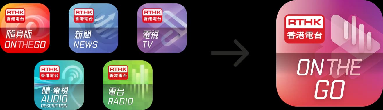
Five existing apps One unified app

Five legacy RTHK applications consolidated into RTHK ON THE GO

Three high-level audit observations identified where a shared structure could replace duplicated content and interaction patterns.

01

Overlapping Apps

Multiple standalone apps contained overlapping content.

02

Inconsistent Patterns

UI and navigation patterns varied across the existing experience.

03

Multiple Starting Points

Related services were split across separate apps, each with its own entry point.

Evidence note: This case study presents the existing-app audit and resulting design artefacts. It does not include participant-based research findings, usability-test results or post-launch product metrics.

05

Design strategy

One product, with a clearer route to content.

  • 01Merge multiple existing apps into one unified product
  • 02Create clearer and more consistent interaction patterns
  • 03Make content easier to discover for a broad audience
  • 04Reduce the number of patterns people need to learn

06

My role & process

From requirements to handoff.

Existing App Audit + System Integration + UX/UI Design + Prototyping

As the UX/UI Designer, I was responsible for requirement analysis, information architecture, user flows, wireframing, visual direction, high-fidelity UI and developer handoff.

01Requirements
02Existing App Review
03Information Architecture
04User Flow
05Wireframes
06Visual Direction
07Final UI & Developer Handoff

07

Information architecture

Organised around tasks, not app boundaries.

I reviewed the existing applications and reorganised their content and functions into a unified structure.

The new architecture provides clear entry points to Radio, TV, News and live information while connecting shared features such as Search, Playlist, Subscriptions and History.

RTHK ON THE GO
DiscoverHomeRadioTVNews
LiveLive streamsTrafficWeather
My LibraryPlaylistSubscriptionsHistory
UtilitySearchSettingsText size

Organised around user tasks and content types rather than the boundaries of the five existing apps.

08

User flow

From access to playback.

I mapped the experience around two connected journeys: account access and content discovery.

The flows show how users enter the product, reach RTHK services and continue from programme discovery to playback and personalised actions.

Rectangle: ScreenRounded rectangle: User actionDiamond: DecisionDark node: Key destinationArrow: User movement
Multiple entry pointsUsers can enter through live content, programmes, news or their personal library.
Shared content structureTV, radio and podcast content follow consistent discovery and detail patterns.
Persistent playback actionsPlaylist, download, sharing and listening history stay connected to the player experience.

Primary journey

Content Discovery & Playback

Use the focused flow paths to explore the system without reproducing every screen-level requirement.

  1. Home leads to a content choice, then to a programme list, programme information, episode details, the player and continued listening.
  2. Live TV and Live Radio take a shorter route through channel selection to the live player.
  3. The player keeps playlist, download, sharing, playback speed, sleep timer and continued listening together.

Supporting journey

Account Access & Recovery

Use the focused flow paths to explore the system without reproducing every screen-level requirement.

  1. Open App leads to Account Access and the decision about whether a user already has an account.
  2. Existing users can log in or recover access with email or mobile number, OTP and password reset.
  3. New users complete required account information, verification, optional profile and interests before returning Home.

09

Wireframes demo

Explore the product direction before production UI.

These exploratory screens show the evolving information hierarchy, navigation and playback patterns.

They document the design direction rather than final production interface exports.

10

Final UI showcase

A flexible media experience in light and dark mode.

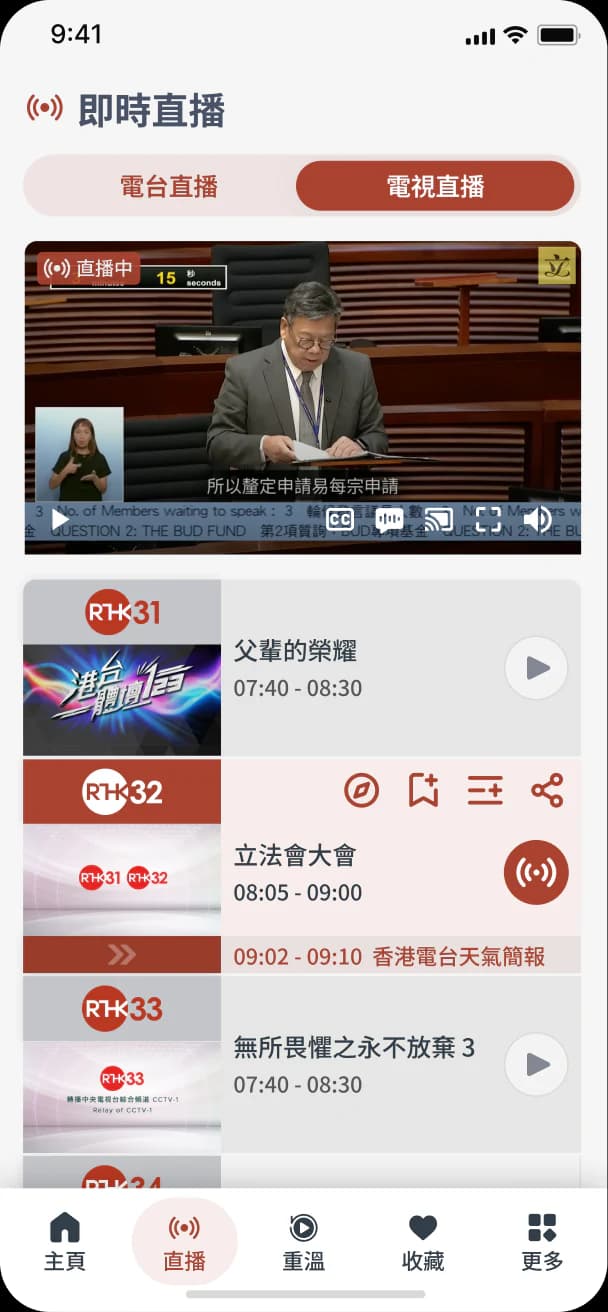
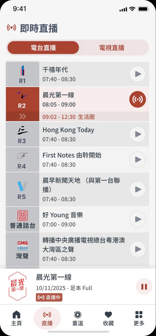
Production screens show how a unified visual system carries through discovery, playback, settings and account tasks.

Switch modes to compare the supported appearances without changing the gallery layout.

11

Accessibility considerations

Readability and control across viewing conditions.

The visual direction includes adjustable text size, light and dark appearances, and explicit playback states.

These examples document design considerations; they are not presented as a formal accessibility conformance audit.

RTHK interface control for small, medium and large text sizes

Adjustable Text Size

Provides small, medium and large text options while preserving the interface hierarchy.

RTHK dark and light mode colour palette

Light and Dark Appearance

Documents the colour system across the two supported viewing appearances.

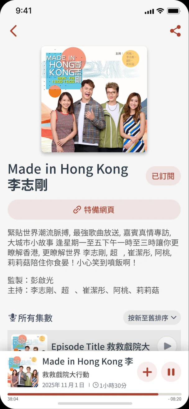
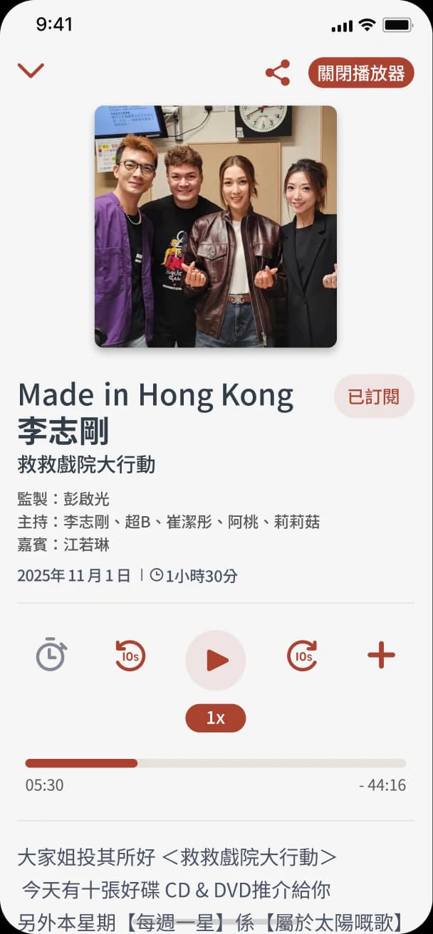
RTHK audio player showing programme details and playback controls

Explicit Playback States

Distinguishes the current programme, playback status and primary controls.

12

Design output

One coherent product direction.

The final direction brings five standalone services into one product structure for discovering, watching, listening and saving RTHK content.

No post-launch metrics are presented here, so this section summarises the delivered design direction rather than measured product impact.

01Defined one product structure for five standalone applications
02Created shared navigation and discovery patterns across services
03Mapped a connected journey from discovery to playback and saved content
04Documented a scalable visual direction with accessibility considerations